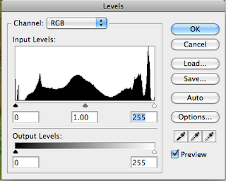
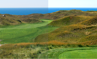
 Adjust the levels of RGB to get a full range image. The easiest way to do this is using the levels function in Photoshop. Notice the three triangles under the histogram. Holding down the option key, slide the highlight triangle to the left until you start seeing some white noise on the screen. Then holding down the option key move the shadow triangle to the right until you start seeing some black noise on the screen. Be careful not to move either too far, doing so will make color too clean and unnatural. A good rule of thumb is to back off each move slightly by moving the sliders back slightly before hitting OK. If your image is too bright move the middle gray arrow to the left slightly. This technique will optimize the color range of the shot. IT IS IMPORTANT to realize that this technique will help maximize the color purity and range of an image but will not make a horrific image better. It may even hurt. Your judgment is still required but this technique will serve as a starting point. Below you will find a before and after sample of an image.
Now you are ready to convert the image to CMYK. Most users simply go to the image menu, to mode and then CMYK. This is probably the most dangerous way to convert an image. Photoshop and Adobe have so many settings for color that it is difficult to know exactly what is happening when you do this. Fortunately, Adobe did provide an additional way to convert color spaces. Under the edit menu there is a function called convert to profile. This tool affords users the opportunity to convert files exactly as asked.
LCP uses two basic profiles and we would be happy to supply them to you. They should be placed in the following directory on your Macintosh: /Library/Application Support/Adobe/Color/Profiles. For most jobs we use GRACoL2006_Coated1v2. Jobs that contain large gray or neutral areas, wood grains, metal objects, whites such as sinks or snow scenes generally print with less color variation when separated using a GCR profile. For these jobs we use a custom profile we call LCP_MaxK_340. In grey component replacement (GCR) the CMY values that add to grey all along the tone scale can be replaced with black ink. Grey component replacement only adds black to the CMY equivalent of what would have printed as a grey.
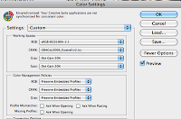
 To convert in this fashion, first make certain that your Photoshop CMYK color setup is set to the target profile (either GRACoL2006_Coated1v2 or LCP_MaxK_340). To do this open the color settings from the edit window and make sure the working space CMYK is set to the target profile. Failure to do this will not have any effect on the end result but will not allow Photoshop to accurately report the CMYK values using its densitometer feature. If you are making color moves based on these readings it may cause your results to be undesirable. See the picture to the right for the color settings screen.
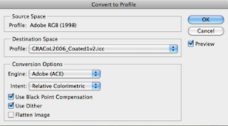
To complete the conversion process we are going to use the Convert to Profile function located at the bottom of the Edit Menu. There are a few things to understand here. Every file has a Source Profile. This is usually embedded in the image and should be left alone. You can change the Source Profile and affect your results but this will take much experimentation and is too much to try and explain here. The next section is where you assign the Destination Space. The profile you choose here should be either GRACoL2006_Coated1v2 or LCP_MaxK_340 depending on whether or not you are looking for a GCR separation that I explained earlier in this post. Finally there are the conversion options. These should be set as pictured below. Changing any of these setting will result in different results.

I cannot stress enough that the above information is a guide to help you provide consistent color among all of the images in your piece. Color is something that takes years of practice and experience and there really is no substitute for a professional color expert.

No comments:
Post a Comment